Azimuthal Averaging#
This guide showcases how to apply Azimuthal Averaging on 2D and 3D fields using UXarray.
Azimuthal mean basics#
An azimuthal average (or azimuthal mean) is a statistical measure that represents the average of a face-centered variable along rings/bands of constant distance from a specified central point. Azimuthal averaging is useful for describing circular/cylindrical features, where fields strongly depend on distance from a point.
In UXarray, azimuthal averaging is non-conservative. This means that faces are assigned to radial bins (i.e., distance intervals from the central point) based only on the face center coordinate.
# The standard library imports and cartopy are used to visualize range rings in this demo
# and are not needed for routine use of `azimuthal_mean()`
import math
import operator
from functools import reduce

import cartopy.geodesic as gdyn
import holoviews as hv
import matplotlib.pyplot as plt
import numpy as np

import uxarray as ux
uxds = ux.open_dataset(
    "../../test/meshfiles/ugrid/outCSne30/outCSne30.ug",
    "../../test/meshfiles/ugrid/outCSne30/outCSne30_vortex.nc",
)
1. Azimuthally averaging an idealized 2D field#
Helper function to draw range rings and visualize azimuthal averaging:#
def hv_range_ring(lon, lat, rad_gcd, n_samples=2000, color="red", line_width=1):
    geo = gdyn.Geodesic()
    circ_pts = geo.circle(
        lon=lon, lat=lat, radius=rad_gcd * 111320, n_samples=n_samples
    )
    return hv.Path(circ_pts).opts(color=color, line_width=line_width)
Step 1.1: Visualize the global field#
The global field is shaded below using the UxDataArray.plot() accessor. To help visualize azimuthal averaging, the chosen central point is marked with an ‘x’ and rings are drawn at every 10 great-circle degrees from the central point (37°N, 1°E).
# Display the global field
glob_plt = uxds["psi"].plot(
    cmap="inferno", periodic_elements="split", title="Global Field", dynamic=True
)

# Mark a center coordinate and draw range rings
lon, lat = 1, 37
glob_plt = glob_plt * hv.Points([(lon, lat)]).opts(
    color="lime", marker="x", size=10, line_width=2
)
glob_plt = glob_plt * reduce(
    operator.mul,
    [hv_range_ring(lon, lat, rr, color="lime") for rr in np.arange(10, 41, 10)],
)
glob_plt
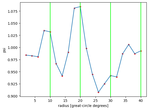
Step 1.2: Compute the azimuthal mean#
Calling .azimuthal_mean() with the arguments below samples every 2° out to 40 great-circle degrees around the central point.
azim_mean_psi, hits = uxds["psi"].azimuthal_mean(
    (lon, lat), 40.0, 2, return_hit_counts=True
)
azim_mean_psi
<xarray.DataArray 'psi_azimuthal_mean' (radius: 21)> Size: 168B
array([       nan, 0.98400088, 0.98263337, 0.98076282, 1.03482251,
       1.03210027, 0.96639787, 0.94121837, 0.99013955, 1.08111055,
       1.08413299, 0.99805499, 0.94448357, 0.90755765, 0.92506048,
       0.94187134, 0.93900079, 0.9867494 , 1.00598615, 0.98697273,
       0.99283143])
Coordinates:
  * radius   (radius) float64 168B 0.0 2.0 4.0 6.0 8.0 ... 34.0 36.0 38.0 40.0
Attributes:
    azimuthal_mean:  True
    center_lon:      1.0
    center_lat:      37.0
radius_units: degreesStep 1.3: Plot the azimuthal mean#
In the plot below, red dots mark where samples were taken at 2° intervals. The green vertical lines correspond to the green rings in the global field plot.
plt.plot(azim_mean_psi["radius"], azim_mean_psi)
plt.scatter(azim_mean_psi["radius"], azim_mean_psi, s=10, color="red")
plt.xlabel("radius [great-circle degrees]")
plt.ylabel("psi")

[plt.axvline(rr, color="lime") for rr in np.arange(10, 41, 10)]
[<matplotlib.lines.Line2D at 0x77b4d2673e00>,
 <matplotlib.lines.Line2D at 0x77b4d1c241a0>,
 <matplotlib.lines.Line2D at 0x77b4d1c242f0>,
 <matplotlib.lines.Line2D at 0x77b4d1c24440>]
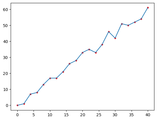
Step 1.4: Inspect the hit count#
The plot below shows the number of face centers that fall within each distance bin. As one would expect on a near-uniformly spaced mesh, the hit count increases linearly with distance.
plt.plot(azim_mean_psi["radius"], hits)
plt.scatter(azim_mean_psi["radius"], hits, s=10, color="red")
<matplotlib.collections.PathCollection at 0x77b4d1cee710>
2: Azimuthally averaging tropical cyclone fields#
A high-resolution (~0.25°) aquaplanet general circulation model permits the development of a handful of strong tropical cyclones (TCs). Because TCs are fairly axisymmetric, azimuthal averaging is useful for transforming their fields into cylindrical coordinates and visualizing features such as their low central pressure and warm core.
clon, clat = 114.54, -17.66
tcds = ux.open_dataset(
    "../../test/meshfiles/ugrid/ne120_TCsubset/ne120_TCsubset.ug",
    "../../test/meshfiles/ugrid/ne120_TCsubset/ne120_TCsubset.nc",
).squeeze()
Step 2.1: Visualize the raw surface pressure field#
Because we are only interested in a single tropical cyclone, the demo dataset has already been subsetted. Otherwise, you can use UXArray subsetting operations to select a region of the global field and speed up plotting.
ps_plt = tcds["PS"].plot(
    cmap="inferno", periodic_elements="split", title="Surface pressure", dynamic=True
)
ps_plt
Step 2.2: Compute the azimuthal mean of the 3D fields#
args = ((clon, clat), 3, 0.25)
azim_mean_T = tcds["T"].azimuthal_mean(*args)
azim_mean_Z = tcds["Z3"].azimuthal_mean(*args)
azim_mean_T
<xarray.DataArray 'T_azimuthal_mean' (plev: 26, radius: 13)> Size: 3kB
array([[         nan, 238.20061042, 238.07972252, 237.99570753,
        238.00888973, 238.00242869, 238.1790747 , 238.06354964,
        238.2623691 , 238.29081298, 238.16468042, 237.98864513,
        237.93356308],
       [         nan, 230.71426473, 230.68629394, 230.48409658,
        230.17606295, 230.1548325 , 229.99708408, 230.07275435,
        229.9634382 , 229.86362381, 229.91860611, 230.02733733,
        230.09972681],
       [         nan, 222.56816843, 222.71253698, 223.24577647,
        224.11031543, 224.13290827, 224.25662631, 224.28844902,
        224.29394859, 224.28484642, 224.29108044, 224.15351119,
        224.08923615],
       [         nan, 224.70788309, 224.12459941, 223.11910753,
        222.09043359, 221.93427246, 221.81130697, 221.55553468,
        221.58022862, 221.64720125, 221.55126155, 221.57687556,
        221.57393756],
       [         nan, 214.80296312, 215.94675235, 217.33697796,
        217.75477968, 218.01371142, 218.15083474, 218.22523588,
        218.26814579, 218.07331526, 218.16901897, 218.3195764 ,
        218.44510226],
...
       [         nan, 298.69938565, 297.14635909, 296.09023807,
        294.6287262 , 294.98888238, 294.97965803, 294.66028762,
        294.4298146 , 294.29170194, 294.0728373 , 293.91746256,
        293.87926481],
       [         nan, 301.02056956, 300.06934219, 299.02027043,
        298.04171151, 298.12230926, 298.04818677, 298.00621268,
        297.90135895, 297.77418827, 297.51214646, 297.38709478,
        297.35003062],
       [         nan, 303.26382152, 302.76179889, 301.71459978,
        301.0084972 , 300.73922974, 300.59966824, 300.5536293 ,
        300.48913686, 300.43193225, 300.33191518, 300.31275195,
        300.24766478],
       [         nan, 305.74284086, 305.2285953 , 304.63768279,
        304.1671658 , 303.89796862, 303.63844544, 303.53381664,
        303.46108039, 303.32145989, 303.15805181, 303.09259189,
        302.90319175],
       [         nan, 307.17291831, 306.62870387, 306.0598156 ,
        305.72815285, 305.61836845, 305.4418119 , 305.36210933,
        305.27861025, 305.11168971, 304.93262769, 304.86391603,
        304.63545043]])
Coordinates:
  * radius   (radius) float64 104B 0.0 0.25 0.5 0.75 1.0 ... 2.25 2.5 2.75 3.0
Dimensions without coordinates: plev
Attributes:
    azimuthal_mean:  True
    center_lon:      114.54
    center_lat:      -17.66
radius_units: degreesStep 2.3: Plot the TC radial profile#
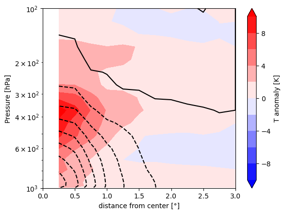
The contour plot below shows the warm core and low pressure of the TC. After taking the azimuthal average, we subtract the value at the outermost radius to obtain an approximate anomaly relative to the ambient environment.
# Subtract the value at the outer radius
Tpert = azim_mean_T - azim_mean_T.isel(radius=-1)
Zpert = azim_mean_Z - azim_mean_Z.isel(radius=-1)

plt.contour(
    azim_mean_Z["radius"],
    tcds["plev"] / 100,
    Zpert,
    levels=np.arange(-500, 501, 50),
    colors="black",
)
plt.contourf(
    azim_mean_T["radius"],
    tcds["plev"] / 100,
    Tpert,
    levels=np.arange(-10, 11, 2),
    cmap="bwr",
    extend="both",
)
plt.xlabel("distance from center [°]")
plt.ylim(1000, 100)
plt.yscale("log")
plt.ylabel("Pressure [hPa]")
plt.colorbar(label="T anomaly [K]")
<matplotlib.colorbar.Colorbar at 0x77b4d0cc5e80>